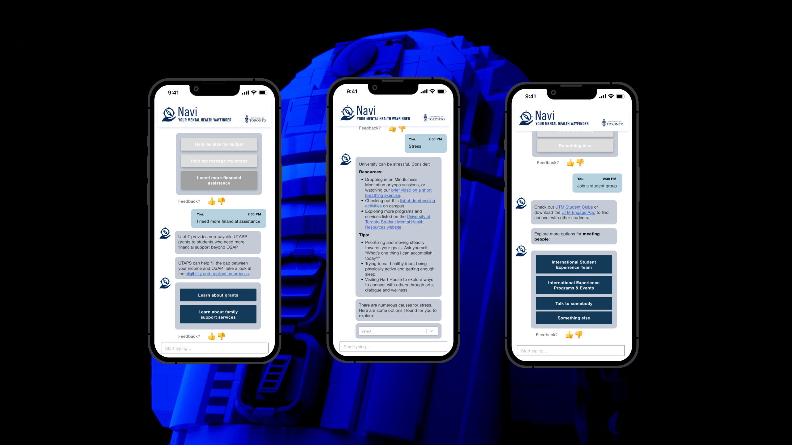
Navi
Navi(gate) your mental health

CHALLENGE
University students and leaders lacked full awareness of all the available resources and didn't possess any means to easily identify and access them.
OBJECTIVE
Redesign the user interface & friendliness of an existing chatbot to increase adoption & usage amongst key stakeholders.
KEY TAKEAWAYS
01 Significantly improved user flow by implementing features that allowed users to more easily navigate and engage with the AI chatbot.
02 Recommended a more directional conversation style to be adopted by the chatbot in order to optimize readability for users at a faster pace.
03 Received CACUSS Innovation Award and is currently being used by over 60,000 students per year.
View Navi

01
User Flow
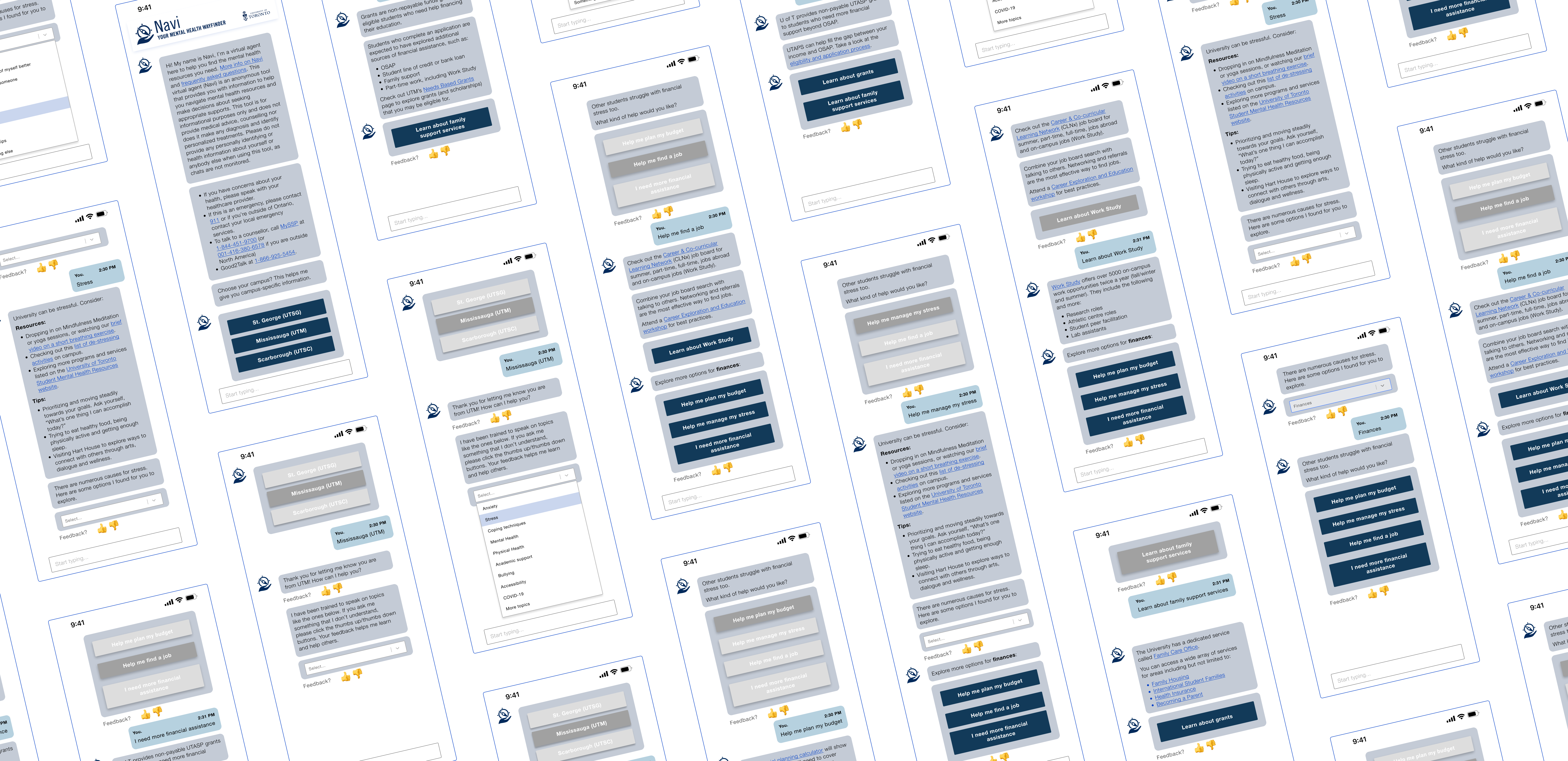
Navigation was improved by inserting important functions, most notably a feature that allowed users to go back amidst ongoing chatbot conversations, especially when provided several options. A feedback feature also ensured that training for the chatbot was prioritized.
02
Design & Testing
Developed high-fidelity prototypes that encouraged longer conversations, which was adopted in the most recent launch. User testing was also vigorously performed over the course of several rounds.
03
Optimized Copy
Readability was an identified challenge that was addressed by reducing the text overload and introducing text hierarchies. The chatbot was trained to deliver more digestible direction through better formatting & prescriptiveness.
CLIENT
University of Toronto
DATE
2022
TOOLS
Figma
Optimal Workshop
© ROYA ADELI 2024
